User Research project
Careers Fair Plus (mobile app)
October 2022
This is a commercial project I completed for my postgraduate diploma in UX design in IADT where I had to redesign the careers fair plus application. For this project, I achieved a grade of B.
1
Research the problem
2
Analyse the user's goals collected from the data
3
Sketch and design the user interface
4
Create a new prototype
TIMELINE
6 weeks
Starting from:
October 2022
SOLO PROJECT
For this project I did all the research and design
KEY GOAL
To develop an improved inteface for the Career's fair app
Finished Prototype


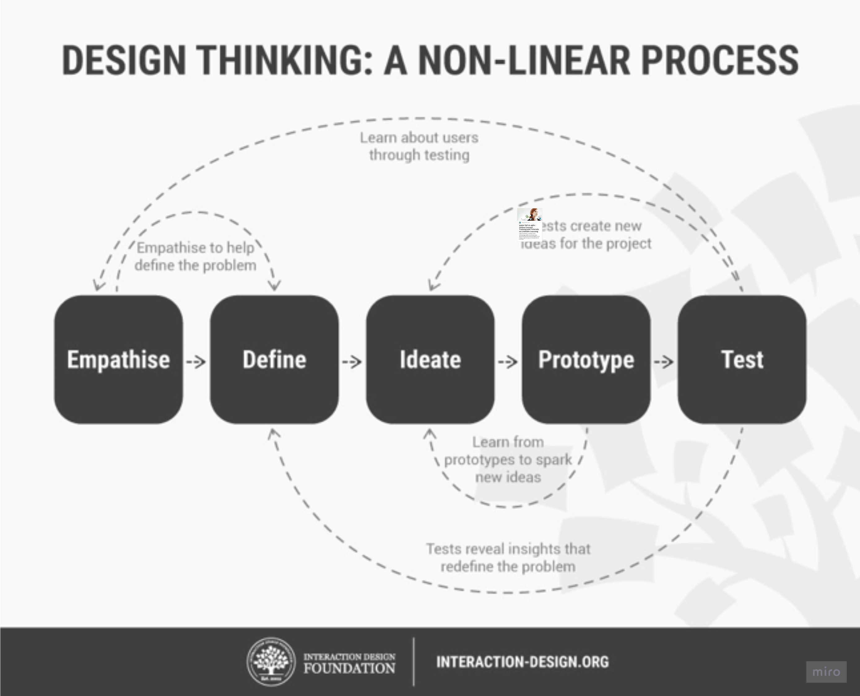
The design thinking framework I used
Interaction design foundation
THE PROBLEM
As a part of my postgraduate diploma in UX Design, I was tasked with redesigning the Careers Fair mobile app. The Careers Fair mobile app is a platform for hosting online and in-person careers fair events for students.
I started my assignment by interpreting the brief that was given to me. My main task was to carry out light user research, analyse that data with empathy artefacts and develop two personas, these are fictional users of the app that a designer creates based on real user research data. I then was to list the common tasks that the personas would carry out, for at least one of the tasks I had to develop a paper prototype of how I would solve the problem and create at least two iterations of it. Finally, I evaluated my prototype using an appropriate evaluation technique..
Main problems found
-
The biggest problem is there is two different versions of the application which behave differently to each other and not all the content is on both versions. The app doesn't even make an attempt to explain this to the user.
-
Navigating to an employer to book a meeting is difficult
-
The app makes no effort to explain to the user that what employers you can search for depends on what career fair you select. It is not obvious that there is a connection between the two.
Research
Heuristics
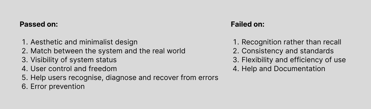
When I developed an understanding of how it worked I performed a heuristic evaluation of the app. The heuristics I used were based on Jacob Nielsen’s 10 heuristics of useability in interaction design.
The results of my evaluation were as follows.
Competitive benchmark
After this exercise, I compared this application to similar applications on the market. This is called competitive benchmarking. The other applications researched were ‘Gradguide’ and ‘Hopin’. I took screenshots of both apps and then stated what I liked and disliked about each application.
This exercise helped me visualise a better solution for the current version of the Careers Fair app.

Usability test
It was now time to run two quick usability tests. A useability test is when a designer sits down with a user and observes them using a product, the goal is to understand any pain points or specific desires the users might have for the product. The two tests I executed were two short guerrilla usability tests where I asked two users to perform one task each.

Empathise
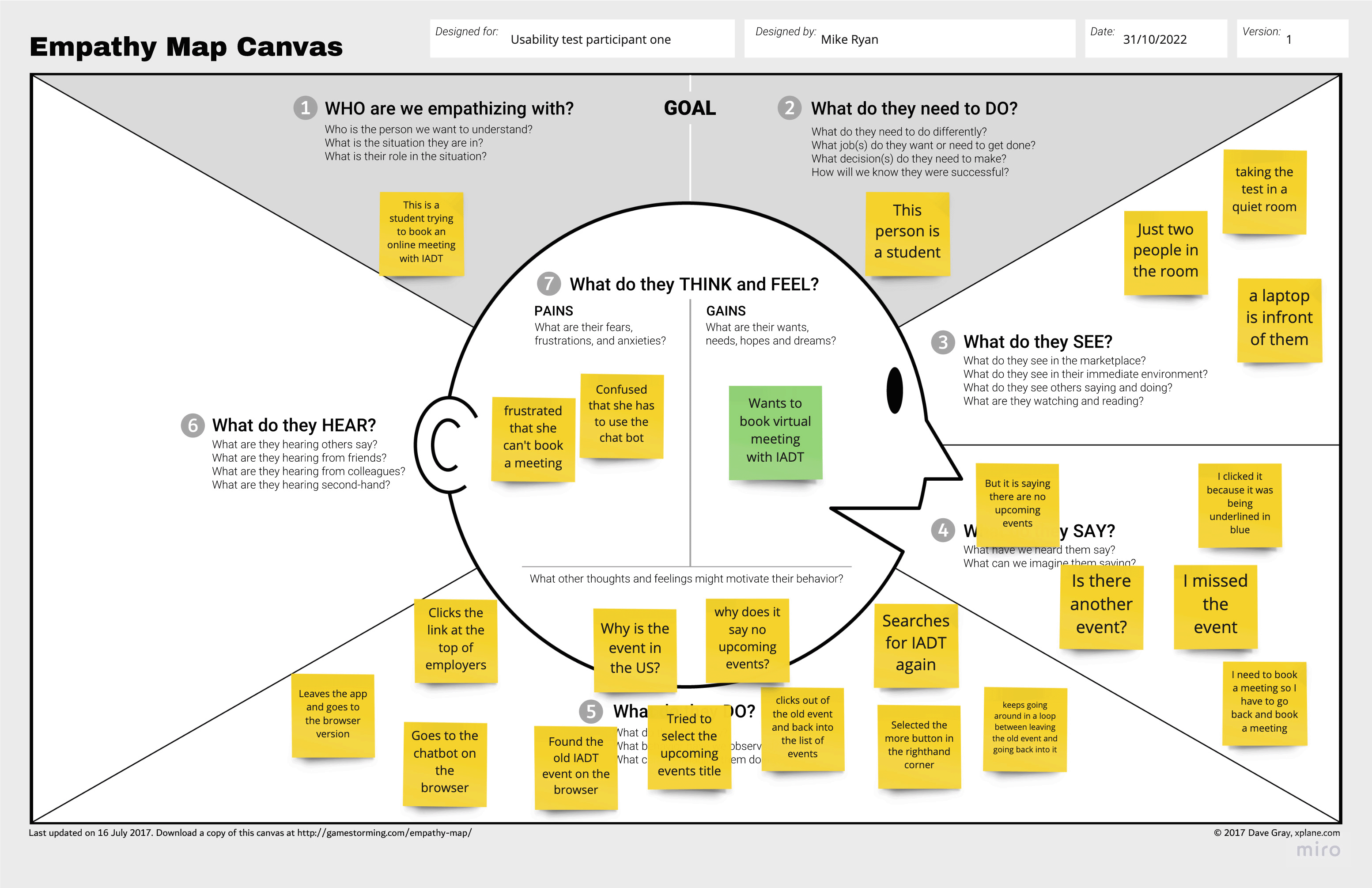
Empathy Map
I analysed the results of the usability test on an empathy map. This is where you map what a user says, does, thinks and feels on a diagram in an attempt to understand their behaviour with a particular product or service. I found this task to be beneficial in making sense of what the user’s goals and pain points were with the Careers Fair app.
Affinity Map
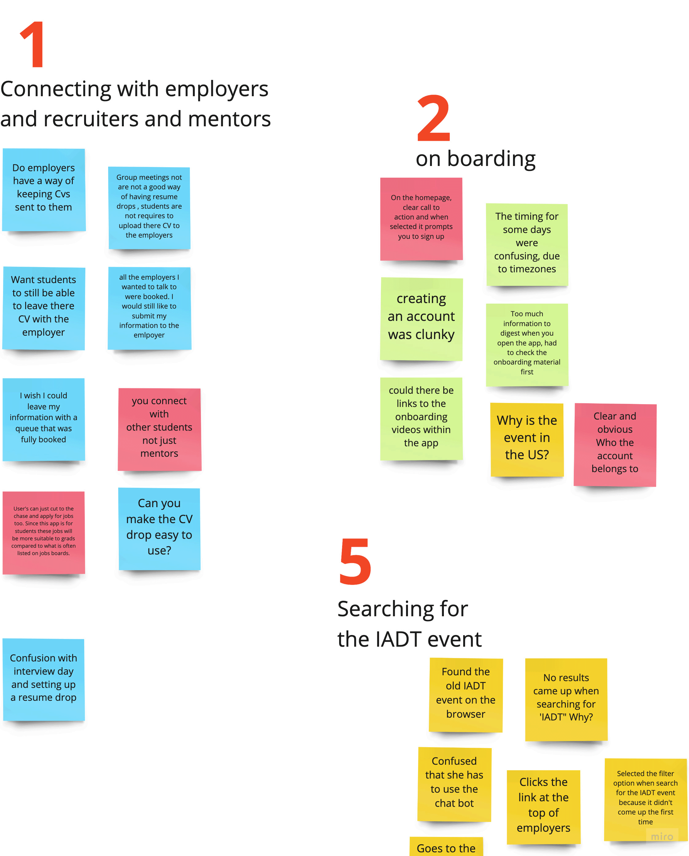
When I had this task executed I then created an affinity map, this is where you place all your research data onto a board with Post-it notes. I used different colour Post-it notes for each different source of research data I had. I used research data from the usability tests, the benchmarking session, and user reviews of the app that were supplied to me for the assignment. This mapping session was incredibly helpful in reducing the cognitive overload I was experiencing from analysing the different data sources.
Customer-journey map
Once I had the affinity map created that allowed me to easily create a customer journey map with the data from the affinity map, this is where you create a diagram of a user’s experience through a product or service[9]. The journey map I created allowed me to quickly see at a glance what areas for users were the biggest problems while flowing through the app.
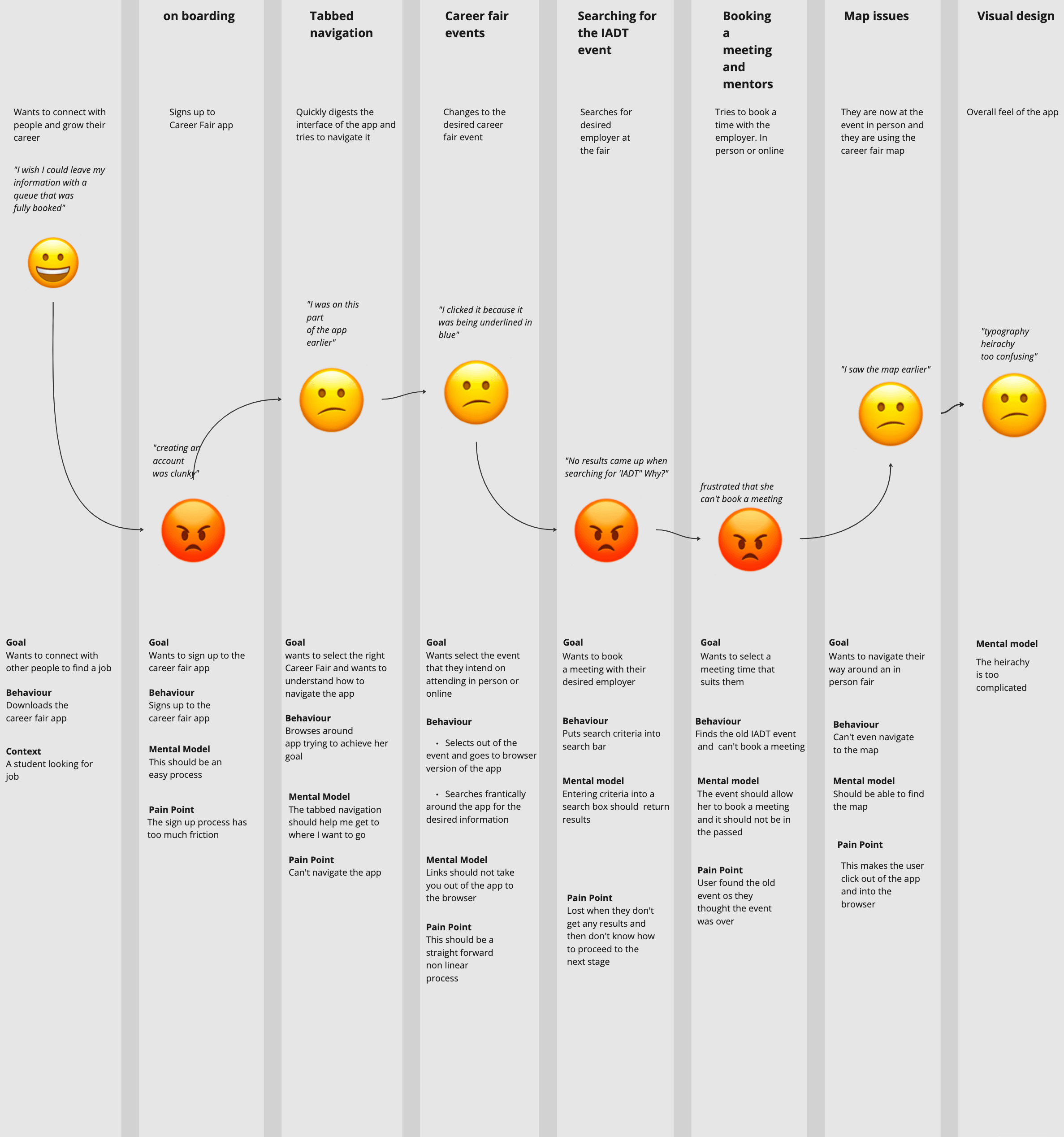
Customer-journey map
It was at this point that I created two personas. I created my personas based on my affinity diagram and customer journey map. The user goals of the personas two personas were to send their CV to an employer and to book a meeting with the employer.

Define
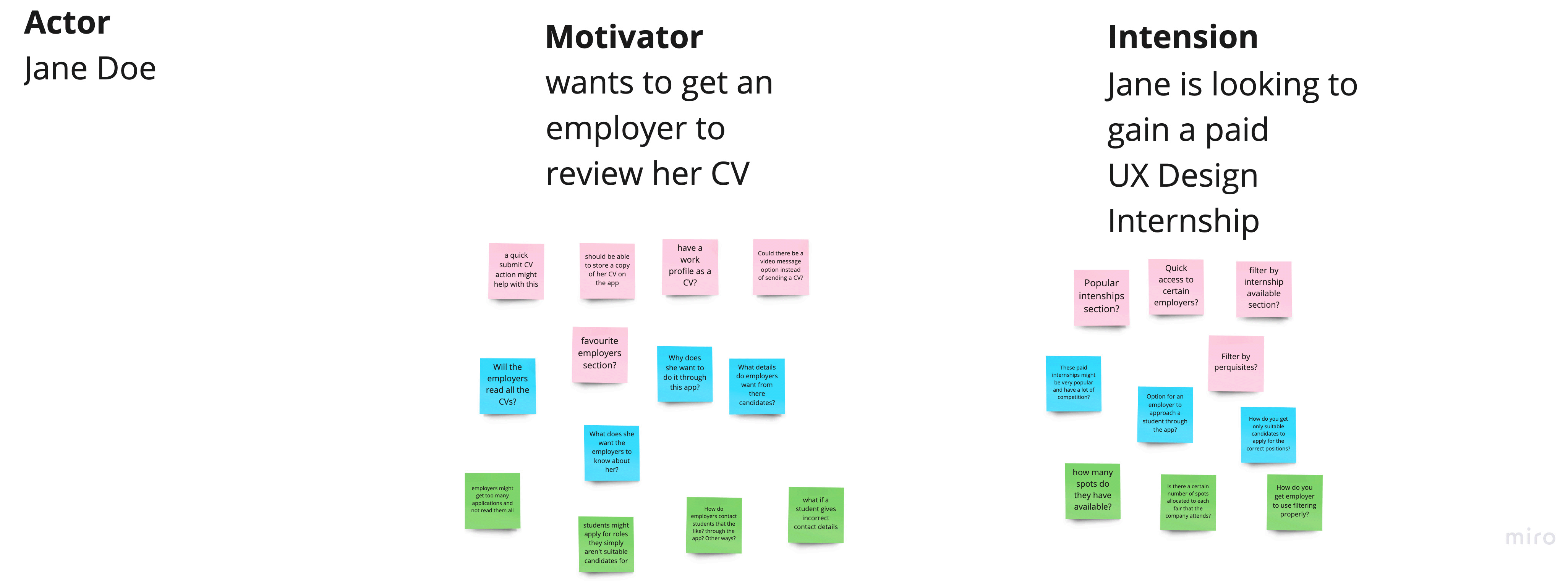
Scenario map
After discovering my two personas I created two scenario maps for each user’s goal in an attempt to discover potential problems with the persona’s goals. A scenario map is a scenario that involves an actor, a motivator and an intention they might have with a particular product. The designer then creates a set of sticky notes about potential issues or comments the actor might have with solving their goals in the given scenario.
The pink sticky notes represent the idea, the blue sticky note represents the question and the green represents the comment and consideration
These scenario maps helped gauge where my personas may run into usability issues while they are flowing through the new design.
How might we statement
I created many different ‘how we might’ statements that attempt to solve the potential problems found from the scenario mapping that a user might face with their desired goals. I felt the scenario map wasn’t very helpful as it just highlighted more potential problems without any clear solution for them.
A how might we statement is a statement that involves a user, a need and a goal or insight. The designer then asks as many how might we question about solving any issues the user may have with solving their problems.
I felt this how might we statement session helped me solve the extra potential problems found in the scenario map session
It was time to attempt to ideate solutions for the problems I had discovered.

Define
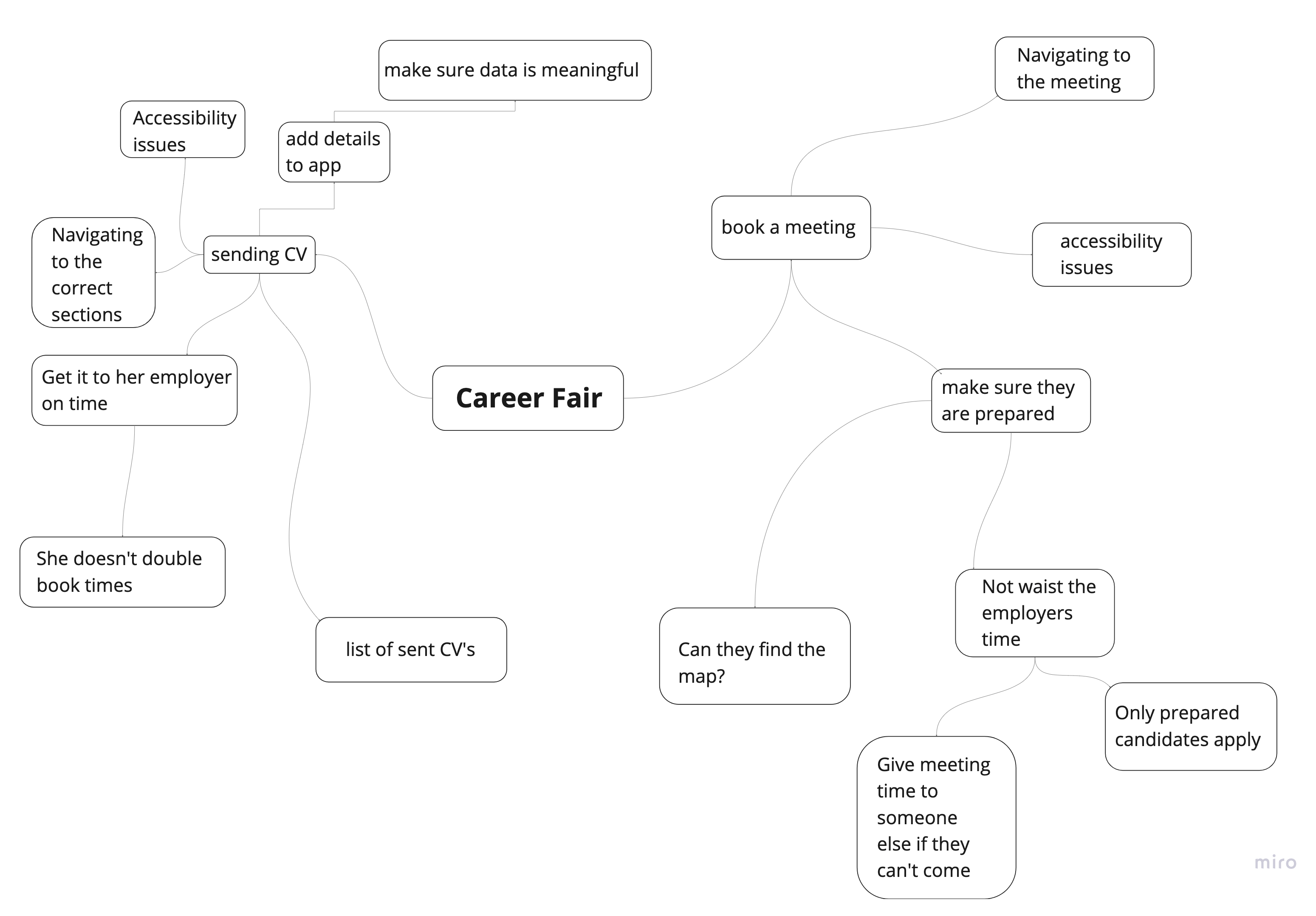
Mind Map
I created a mind map and drew up several new user flows for the app. I did this to visualise how a better version of the Careers Fair Plus app might work. I created the mind map using Miro after I started my how might we statement.
I felt this mind map helped to begin to imagine a better user flow for this app.
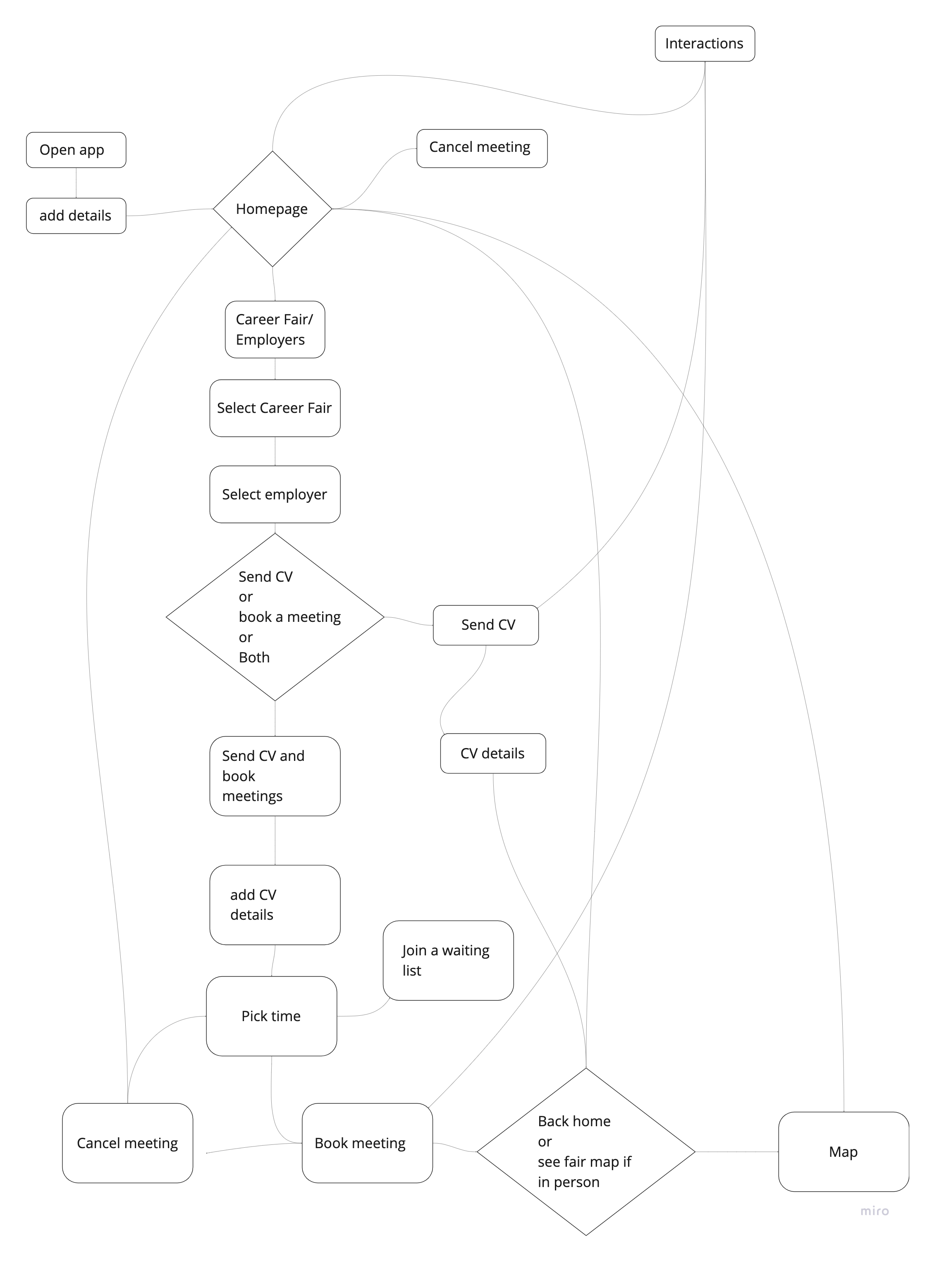
User flows
I created a mind map and drew up several new user flows for the app. I created a storyboard of my two personas opening up the app in a certain context to help me visualise when they might use the app. It was time for paper prototyping, I drew improved user flows for a user navigating from the home page to sending their CV to the employer and booking a meeting with employer pages.
Storyboard
I created a mind map and drew up several new user flows for the app. I made a storyboard of my two personas opening the app in a particular context to help me visualise when they might use the app. It was time for paper prototyping, I drew improved user flows for a user navigating from the home page to sending their CV to the employer and booking a meeting with employer pages.
THESE WERE SOME MAJOR LEARNINGS OR POINTS WE WANTED TO CALL OUT
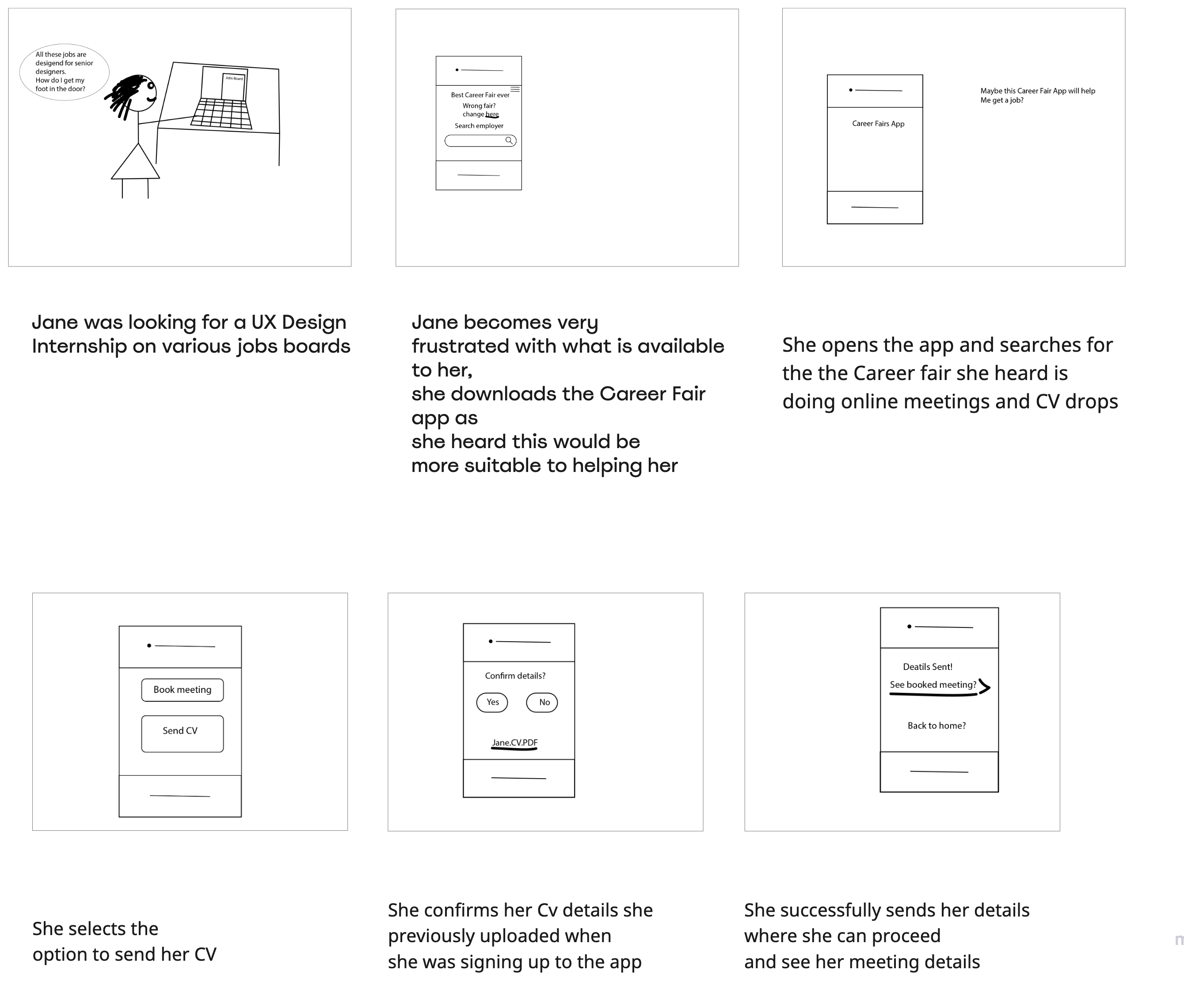
Prototype Paper prototype
I asked a colleague to attempt to navigate their way through my paper prototype. When they selected where they wanted to go on the paper prototype I placed a new screen over the current screen on the table in an attempt to simulate a real-life working app. The user completed the task I asked them to perform which was to book a meeting with an employer at a careers fair event.

Paper prototype details
After I created the paper prototype I took pictures of my prototype and added them to my Miro board. I did this so others could understand this prototype if they were to flick through it or watch the prototype video.
I annotated the paper screens the same way I annotated the screens using the same style as I did in from the competitive benchmarking session.

Reserach Part two
Research
I did not put as much research into the next part as I was approaching the deadline soon.
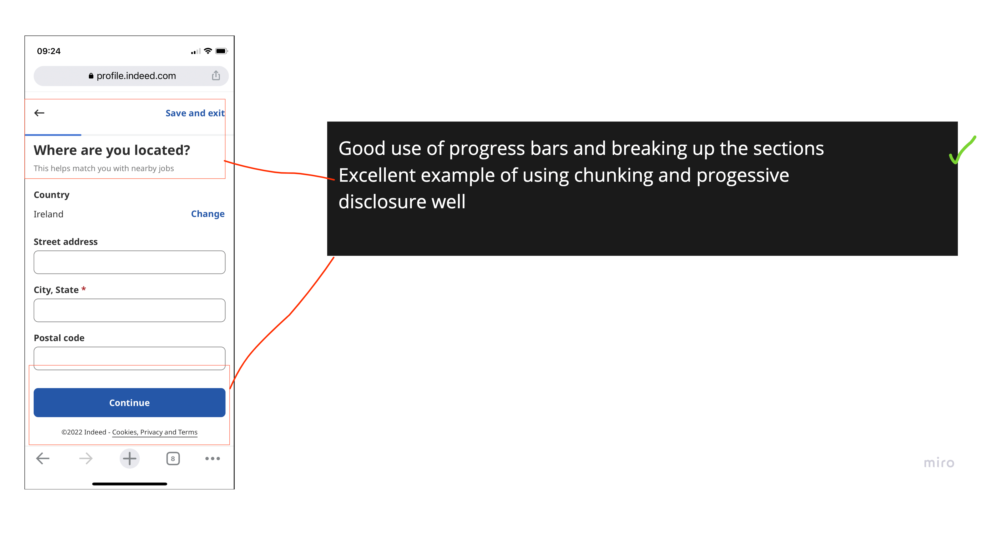
I discovered that I needed to understand the issues with onboarding on the app so I executed another competitor’s analysis on Indeed and Irish Jobs. ie mobile websites. I then began more paper prototyping and ideating on a new improved onboarding process based on what I learned about Indeed and Irish Jobs. ie
Digital prototype, usability test, presentation and evaluation
I created a digital prototype in Figma and I tested my interactive mockup with three users. I based my prototype on the second set of paper iterations and made some further changes. I asked the users to answer three questions at the end of the usability test, I did this in an attempt to critically evaluate my prototype. The questions I asked were a mixture of formative and summative questions. A formative question tells a designer why their product has the issues that it does. In contrast, a summative question gives the designer data for comparing their product to what exists already on the market.
Click here to access the Figma prototype
I have also added a video of the prototype.


Presentation
At the end of the project, I had to present my work to the rest of the class and the guiding mentors. I found this experience an excellent opportunity to gain insight into my blindspots regarding decision-making. One area of poor decision-making during the process was that my project was too broad for the scope of the project.


LESSONS LEARNED
Overall I found that my prototype improved the user’s experience with the Careers Fair app, only light research was carried out for this project so deeper research would be required to prove this officially. If I was to execute this project again I would do all the research at the beginning of the assignment as this timeline was too short for two research sessions. Moving forward from this assignment I still need to learn how to manage my time at each stage of the design thinking process. I felt I moved too quickly from each stage and I would have benefited from going slower through the assignment. This resulted in two rounds of research which were not necessary for a seven-week-long assignment.
Another learning outcome I gained from this experience was that I should have ideated more when I was creating my paper prototypes as this would have helped me to anticipate usability problems early on in the design process and usability issues are easier to mend at this stage than in later stages.
If I was to execute this project again I would develop better personas that are easier to empathise with as the personas I have created for this project do not feel like real people. One reason for this may be due to only light user research being carried out for this project so my understanding of the users isn't very rich. Unfortunately, the tight deadline of this project didn't allow for deeper research to be carried out