Usability testing project
Cashel Blue Farmhouse Cheese
(mobile website)
February 2023
This is a usability testing project I completed for my postgraduate diploma in UX Design. I had to research a problem with the Cashel Blue mobile website then develop a new solution to that problem and test it with users and then further refine the prototype based on the results of the usability test. I had to deliver my finished prototype in high fidelity too, this was a requirement.
Link to full project here
1
Research the problem
2
Analyse the user's goals collected from the data
3
Sketch and design the user interface
4
Create a new prototype and test with users
5
Visual design
TIMELINE
13 weeks
Starting from:
Februrary 2023
SOLO PROJECT
For this project I did all the research and design
KEY GOAL
To develop an improved inteface for Cashel Blue
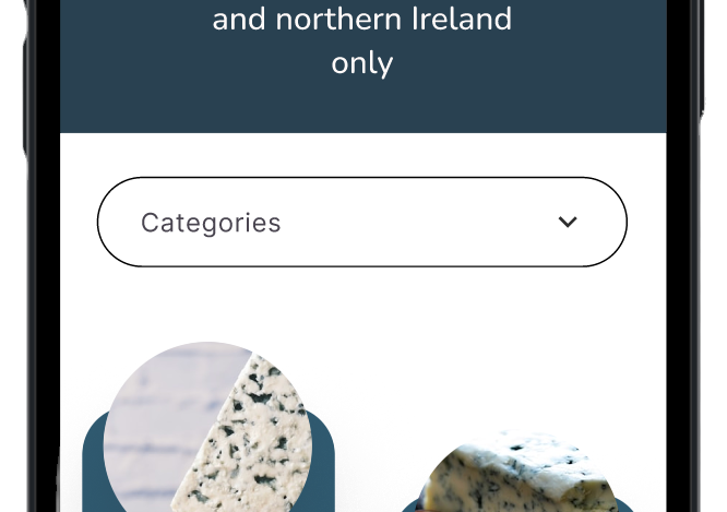
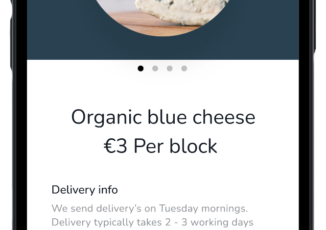
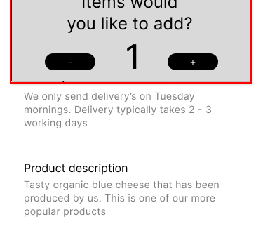
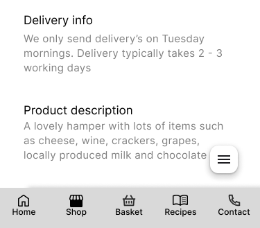
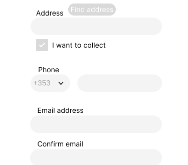
Finished Prototype
The design thinking framework I used
I decided to use the design thinking framework for this project as it allows me to easily ideate and refine any prototype I created.
The research phase was where I researched the problem and collected data about the users(1). The empathise and define stage was where I analysed the user's goals collected from the data(2). The ideate stage was where I sketched and designed new screens(3). The prototype stage was where I created a digital prototype stage and the test stage was where I tested this prototype with users(4).
This project consisted of an initial research phase followed by two design sprints, similar to how Google execute design sprints.
After the first round of testing, I went back to the ideate stage to sketch and design new screens based on the problems found during the first round of testing. I then proceeded to improve my prototype based on the second round of testing. I tested the new prototype with users to validate or disprove my new design.
When the entire design thinking process was complete I turned my prototype into a high-fidelity design(5).


Google's design sprint framework
THE PROBLEM
As a part of my postgraduate diploma in UX Design, I was tasked with redesigning the Cashel Blue mobile website. Cashel Blue Farmhouse Cheese is a local Irish cheese brand. For this project, I researched the online farm shop and the recipes sections only. I chose two sections only as this was specified in the brief for the project, I picked these two sections as I had personal usability issues with the online store. I picked the recipes section as I got a sense that the website was trying to behave like a meal delivery service like Hello Fresh. The website sold products and then offered recipes to create with those products just like Hello Fresh.
I was required to collect at least one quantitative and one qualitative piece of research and create two personas based on the research collected. I then had to redesign my two chosen sections based on the data collected and create one digital prototype of the two sections.
I started my assignment by picking a product to redesign for the project. I chose this product due to personal previous bad experiences with the mobile website, I failed to purchase a hamper from the website. I researched two sections of the Cashel Blue website and then created a digital prototype of one of the sections as this was a requirement of the brief. I executed light user research and created two personas and analysed the persona's goals. I created a prototype based on these two personas and then tested the prototype with three users and further refined the prototype based on the results. I tested the refined prototype with two more users to validate the new prototype for improved usability. I finished the project by making the prototype UI high-fidelity.
Phase 1
Initial reserach
Research
Secondary research
I started off this project by first reviewing other research that was conducted on the topic of food and e-commerce, I read reports online and I reviewed articles on Google Scholar. I started with secondary research as I wanted to understand the problems with the food and e-commerce industry to put my project in perspective of those problems. Reviewing secondary research may also offer solutions to problems found during the primary research section.
Heuristics
I started off the research by conducting a heuristics evaluation. The heuristics I used were based on Jacob Nielsen’s 10 heuristics of useability in interaction design. I did not gain much interesting data from this session so I didn't use the data gathered from it in the empathise stage.

Competitive benchmark
After this exercise, I compared this application to similar applications on the market. This is called competitive benchmarking. The other applications researched were Hello Fresh, Drop Chef Just Eat, Deliveroo, Eatsthro, Gourmet Fuel, Ballymaloe Relish, Keoghs, O'Donnells crisps, Brennan's bread, Keogh's Crisps and SuperValu. I took screenshots of all the apps and then stated what I liked and disliked about each application.
I benchmarked these products as they have similar use cases to the Cashel Blue website, they are all online platforms for purchasing food online. They also may have the same target audience, which is users looking to purchase local Irish produce. However, the scope of this project did not allow me to validate this idea. See here for everything I reviewed.
This exercise helped me visualise a better solution for the current version of Cashel Blue.


Survey
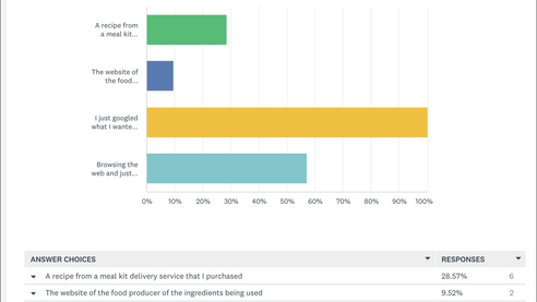
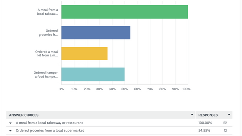
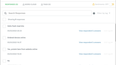
I executed a survey and collected responses from 23 users where I asked them about their behaviour around purchasing food online and cooking from recipes that they found online. I displayed the results of my current on my Mirobaord along with the rest of my project so far.
User Interviews
I conducted two user interviews online using Zoom and I then translated the interview using Dovetail. I recruited the participants from users who answered my survey. I found this exercise to be helpful for giving me rich qualitative insights into users' online food purchasing behaviour. If I was to redo this section I would conduct three more interviews with different users as I felt my project lacked qualitative insights from users.
I chose to conduct user interviews as it was a low-fidelity way of collecting data about users' attitudes towards purchasing food online and cooking from websites.
Empathise
Affinity Map
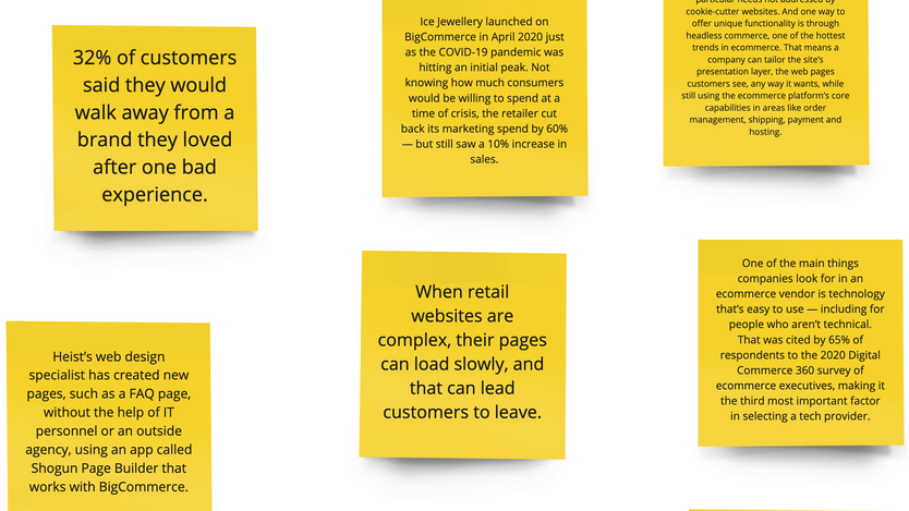
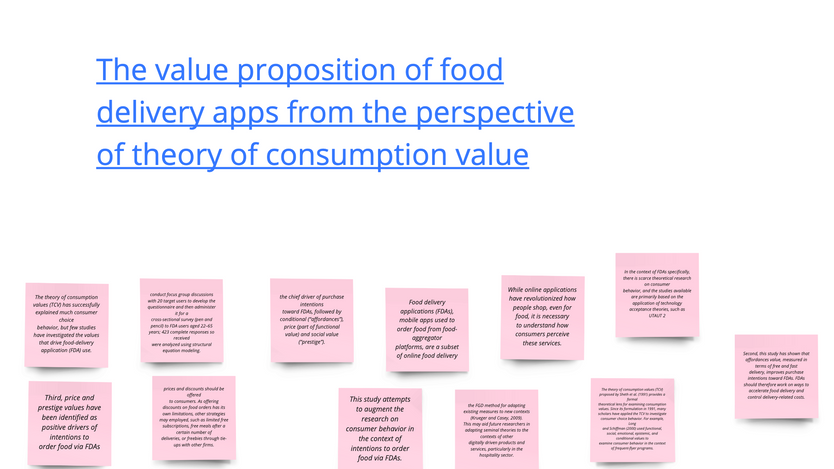
It was at this point I started to analyse the data I collect. I put the data from the secondary research I reviewed, the survey data and the user interview data into an affinity map and began to analyse the data altogether to try and find common themes amount it all.

Personas
After I created the affinity diagram I decided to use the categories I had created and turn them into two personas. I felt creating the persons was a helpful way of digesting all the information I had created and being able to turn it into a story. My primary persona was Sarah Jones, she wants to purchase cheese and a hamper from the Cashel Blue website. She is a massive food fan and usually gives food as gifts to people instead of purchasing hampers. My other persona was Tom Murphy, he loves to cook and try different dishes. He wants to find a new recipe to cook from on the Cashel Blue website.

Primary persona

Secondary persona
Scenario map
When I had created both my personas I decided to analyse their goals and desires in a scenario map as this would help me to empathise with these two users. A scenario map is where a user is put in a scenario where they are trying to attempt to use the product. Their motivations, intentions and needs are analysed by writing an idea about each step, asking a question about that idea than writing a comment about that question.
This exercise helped to foresee potential features, issues and goals for this project.

User needs statment
After the scenario map session, I then created a user needs statement for each persona. This is when the persona's needs and goals are written in one clear sentence. This is to give a clear vision of what you are trying to achieve when solving problems for your users. I felt my user needs statement helped me gain a clear idea of how I was trying to solve the problems with the Cashel Blue website.

How might we statment
I created two how-might statements, one based on each user needs statement. A how-might we statement is when you ask questions about the user's need and their goals with the need. These questions should help anticipate potential usability problems the user may run into when they are trying to solve their problems with the product. the how might we statement should be based on your persona's goals and desires. This how might we statement session did allow me to understand where the user might run into difficulty with the new prototype I had envisioned.
Define

Main problems found
-
The online shop and recipes section is too difficult to use.
-
The website is also just full of clutter and visual design is not appealing
-
There is a disconnect between the recipes section and the online shop which there should not be after reviewing online competitors.
Phase 2
Design sprint 1
Prototype round one
Two as is states
I started the prototype stage by first laying out the current state of the two sections. I put each screen state beside the other and stated what the problems were for each user flow. This created a launchpad for me to begin to improve the UI and help me see how I might implement the findings from my research into the prototype.

Flow chart giving overview of the structure
I created this flowchart which shows at a high-level information architecture of the two sections and how they flow together.

'Two be' customer journey maps
I created two customer jorney maps of how I imagined the users might flow through the new prototype. This helped me understand how the flow of the new prototype might work. It also gave me something to compare the results of the actual customer journeys when I tested them with users.

Sketching the new screens
part 1
It was at this point I began to sketch the new screens. I took inspiration from my competitive benchmarking session where I looked and how competitors created similar mobile experiences. I also kept in mind the results from my empathise stage and who my users were. This paper prototyping session was useful as it allowed me to see potential issues with each paper screen. Since the screens were paper it was very easy for me to keep ideating until I got a set of screens that I was happy with.
After the paper prototyping session, I took pictures of each screen and put them on my Miroboad with the rest of my project so far. I then stated how the screens worked to make it clear for others viewing them.


Digital prototyping first round
When I was happy with the end result of the paper prototyping session I then turned my final designs into digital prototypes using Figma. I used Figma as it is the industry standard tool for UI design. I was happy overall with my ability to turn what I drew into a digital prototype, having previous experience using Figma helped with this.
I decided to use a Figma library to get me started with the digital prototyping as I found one that was similar to what I had created during paper prototyping. Since I was creating an e-commerce app I had to make sure I followed the correct e-commerce design conventions to aid the heuristic of consistency of standards. Using a Figma template of a food delivery app helped with this. I implemented the template into my designs taking the relevant UI components out of the template and placing them in my own designs. I also took inspiration from two other Figma libraries, one was another Food delivery app and the other was Google's Material Design 3 library as my prototype was based on Googles 8 point grid. I found working with this grid system very helpful as it aids decision-making with layout and grid styles.
Overall I was happy with my ability to integrate the two libraries and Google's material design style guide into my digital prototype.
Testing round one
First round of usability testing
when I was happy with the first digital prototype I decided to test the prototype with three users. The usability test setup I used was I asked the users to interact with my Figma prototype on my laptop and I recorded the session with Quick time player. I conducted the testing in this way as a low-fidelity way of getting user feedback on my prototype and it meant that there was less scope for technical difficulty during the session. This was one of the benefits of having the session in person, another benefit was that it meant that users could give me rich qualitative feedback on my prototype since they were in the same room as me.
The three users I tested the prototype all matched my primary and secondary persona as they all has previous experience with purchasing food online cooking from a website.
The main issues the users had with the first prototype were adding items to the cart and increasing the number of items, viewing the cart after adding items, there was no way to check the basket before going to the checkout, creating a custom hamper was difficult and so was navigating the sliding drawer.
Another area that caused huge difficulty for users was that the prototype was not fully interactive and this annoyed users as it interfered with how they would naturally flow through the app. If I was to do this part again I would make the prototype a lot more interactive.

Empathy map
After each usability test, I created an empathy map to analyse the results of the session. An empathy map is when a user's behaviour from usability is broken up into four categories: what they say, what they do, what they think and what they feel. These are a great way of gauging a user's experience with a product and dividing up the attitudinal and behavioural data from the test so it can be analysed separately. I found this approach helped me understand how to improve the prototype with regard to understanding how the user flowed through the prototype and their attitudes towards that prototype as a result of how they used it.

Customer journey map
After I created an empathy map for a participant's usability test, I then created a customer journey map of their experience. A customer journey map is where you plot the user's journey with interacting with a product from start to finish. you then mark on the map where the user had difficulty with the project and what parts they found easy. this is helpful for uncovering the main points for users as they interacted with a prototype. They are a more scientific way of understanding a user's behaviour with a product compared to an empathy map.

Please see below which highlights the main issues users had with the first round of prototyping.
Phase 3
Design sprint 2
Prototype round two
Competitive benchmark
part 2
I started the next round of prototyping by first benchmarking products that had executed the problem areas for users better than my current version. I took inspiration from products such as Asos, Bliss, Home and Gifts Ireland and Glossier. I picked these products because of how user-friendly I found using the e-commerce platform experience on these sites. All the problems my users had with my product were around not implementing e-commerce structure and navigation correctly.


Sketching the new screens
part 2
Taking from what I learned in the first round of testing and the second round of benchmarking other products I decided to resign my prototype. This started with sketching new screens for the main areas that caused problems for users; adding items to the basket, entering the basket, navigating the sliding drawer and creating a custom hamper.
I found sketching new screens a helpful way of quickly ideating on a better version of what I currently had developed for the areas that caused difficulty for users.


Digital prototyping second round
I began to turn my new sketches into a digital prototype. This time I was only redesigning certain parts of my prototype so it didn't take as long to complete this round of prototyping. I changed my prototype based on the screens I sketched in the second round of prototyping.
Testing part two
Second round of usability testing
After I created my new prototype I decided to test it with two users. This time I did not conduct a mini-interview at the start of the usability test I just asked users to flow through the prototype. I did this because I was only interested in validating my prototype for improved or disimproved usability. I was getting close to the deadline for the project so I did not have the time to empathise with the data collected from the second round of the usability testing. This is also why I only tested my prototype with two users this time.
I found that my new prototype did improve the user flow but not having my prototype fully interactive still caused problems for the users.

Visual design
Reviewing current branding and style
After I finished the second round of usability testing I then began the visual design process as this was a requirement of the brief that was supplied to me.
I started this process by reviewing the current brand style for Cashel Blue. This section of the project didn't allow for an entire rebrand of the product as the deadline for the project was getting closer. This redesign was to just update and modernise the current UI for Cashel Blue.
Typography
After I reviewed the current style of the Cashel Blue website I began to review other typefaces as I felt the typography was out of date and did feel suitable for a food product. I began to review other competitor's products such as Just Eat, Deliveroo, hello Fresh and Drop Chef. I reviewed these products as these brand styles represent the modern food delivery style and taste.
I reviewed many fonts such as Raleway, Lato, Fredericka the Great, Great, Nunito, FontAwesome, Roboto, Montserrat and Open Sans. I decided to use Robo Slab as my title heading and Nunito as my content font heading.


Colour
After I had picked a new typeface I then decided to try and improve the colour pallet for the website. Since the product already had a set of brand colours I stuck with was currently there but I simplified the product to four colours. White background with black text, yellow for interactive colours and navy blue for the main brand colour.
Colour pallet used

Components used
Since this prototype was based on Google's Material design I decided to use the material design icon pack for my icon pack. These are commonly used icons used in UI design so users would already be familiar with the icons which aid in the usability of the application. Since I used a Figma library to start the prototype the space and alignment I used were appropriated from that library. I did this because the deadline was approaching so I did not have time to design the prototype from scratch and the current space and alignment were appropriate for the prototype as the library used was a food delivery library.
Finished prototype

LESSONS LEARNED
I was happy with the end result of the prototype based on the research I conducted. However, if I was to do this project again I would collect alot more primary research at the beginning and spend less time reviewing secondary research. This is because collecting direct user feedback on the product I was redesigning was much more useful than reviewing lots of similar studies.
I would have also liked to have tested my product with more users as the more feedback I gained on my prototype the more I learned where the problematic areas for users were. However, the timeline for the project made it difficult for me to recruit more users for in-person testing.
I was happy with the visual design but I would have liked to design desktop and tablet versions of this prototype. I did not have as much time as I thought I would create the visual design as I thought but I was happy with what I created in the short window that I had. If I was to do this part again I would have created the visual design before I tested it with users to gain user feedback on the visual of the prototype. this current visual design is poorly socialised and would be improved with more user feedback. I left the visual design to the end as I wanted to validate the structure of the application before I created a visual feel for the mobile app. If I was to do this part again I would not do it that way and create the visual design before I tested it with users.

